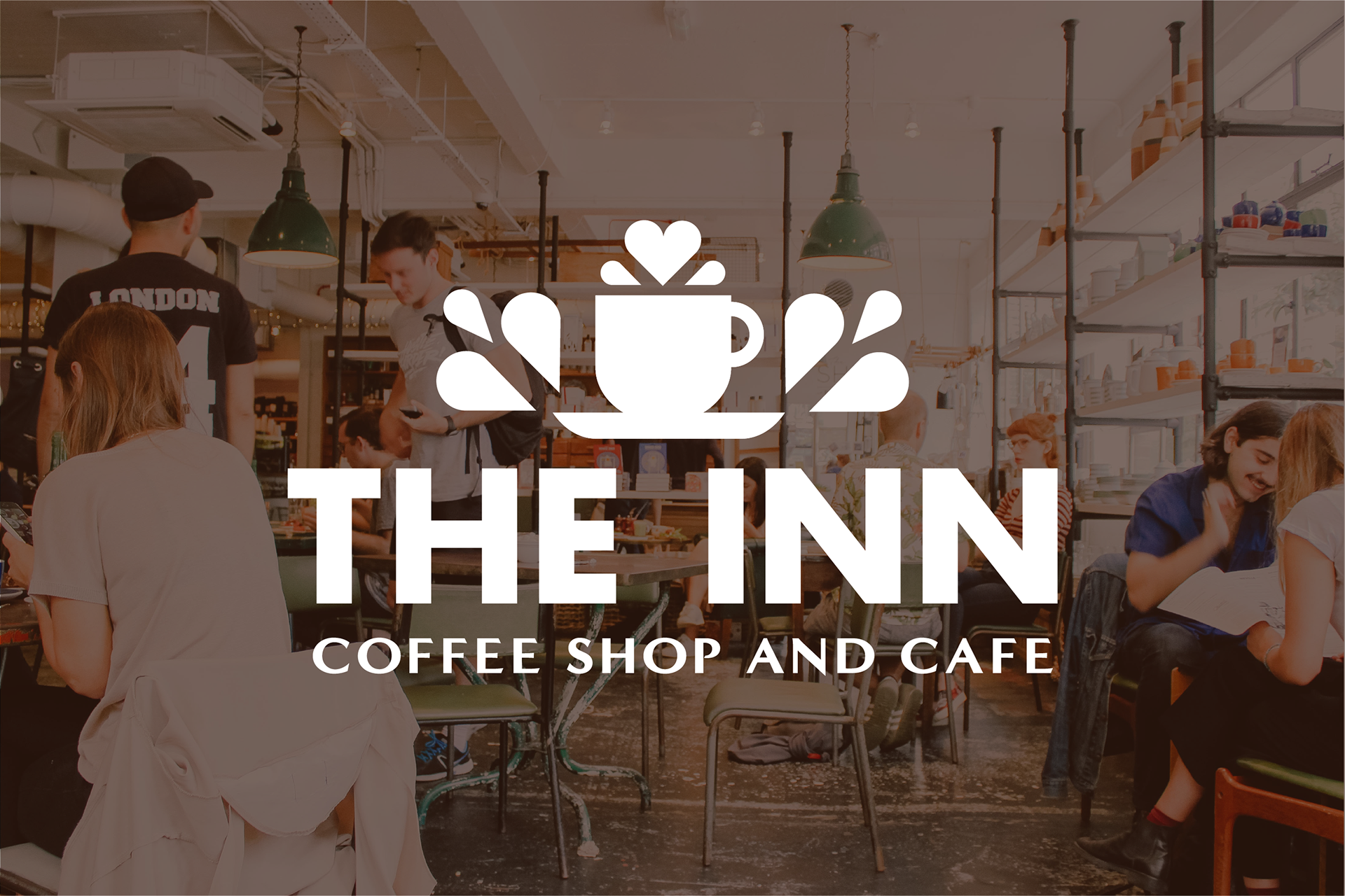
Named after the Stonewall Inn, The Inn is a place for LGBTQ+ people who aren't comfortable with typical gay bars. The Inn is a brick and mortar home for the underage, sober or older members of the LGBTQ+ community, but is also a place for straight allies and friends who may want to learn more about the community. Brand words for this project are home, safety, and support.
logo process

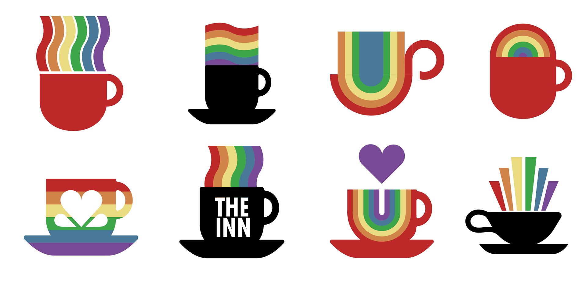
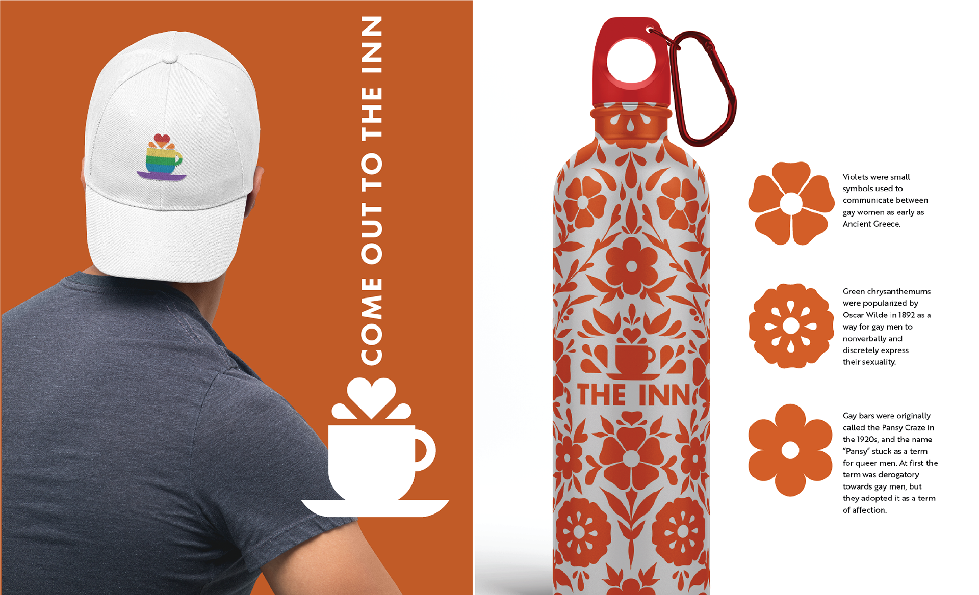
One of the design challenges that came with the Inn brand was a matter of safety. What if a questioning teenager with non-affirming parents came home with a rainbow logo on a coffee sleeve or receipt? What would happen if an employee had a pride colored logo on their shirt and was followed home?
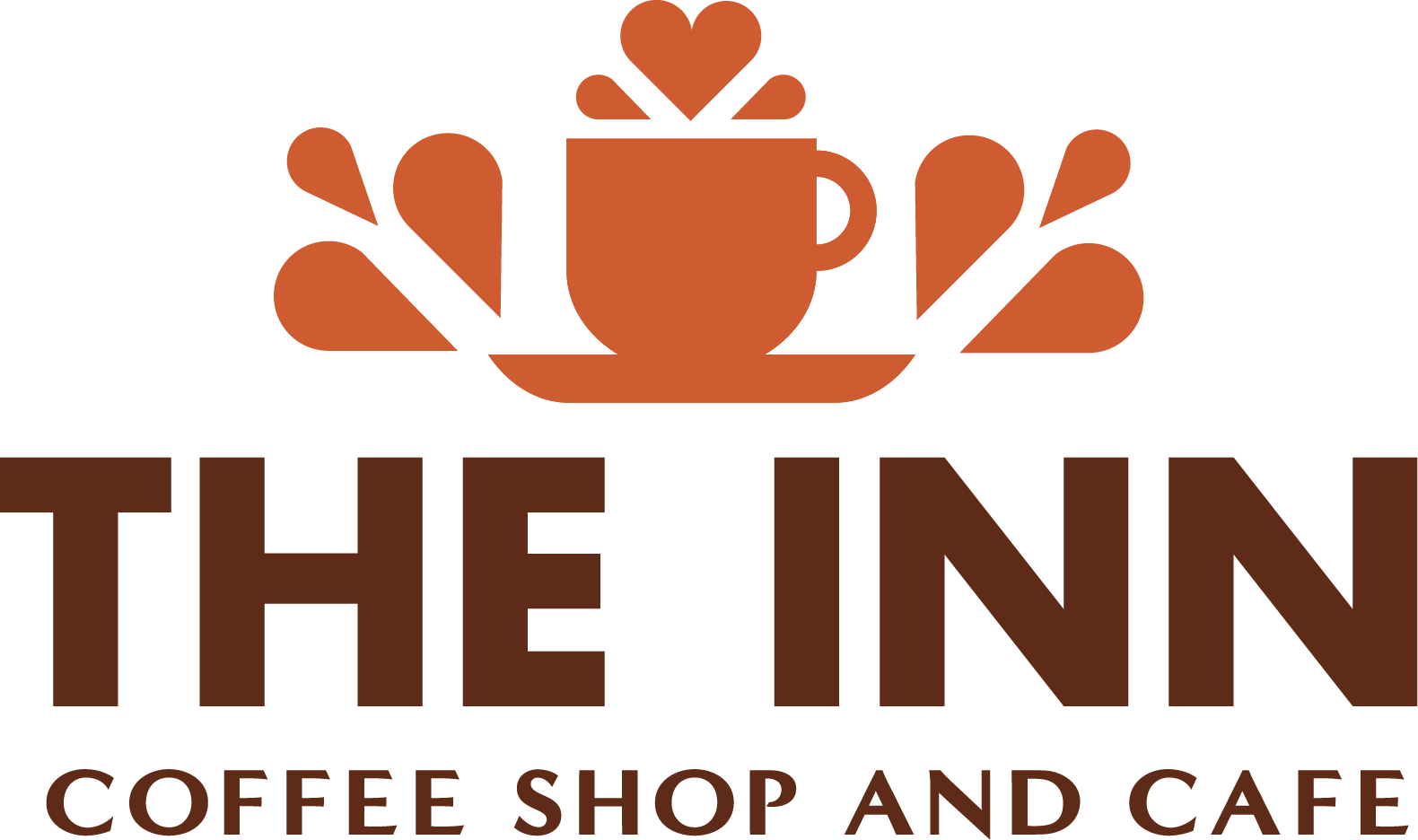
While a pride colored logo could be an option for merchandise, I chose to predominately use the warm brown mug with and without splashes to represent the brand as a whole so that both queer and straight customers would feel as safe, welcome, and comfortable as possible.
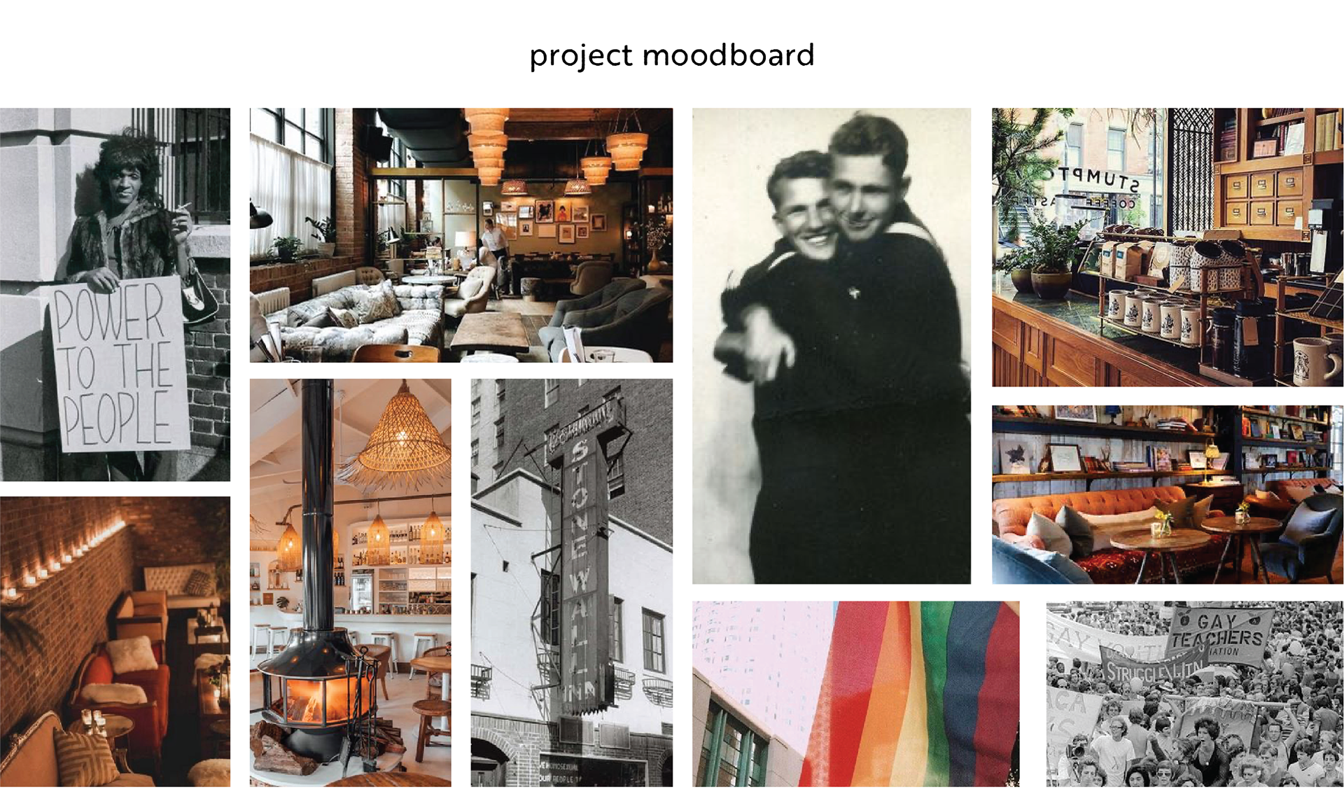
Interior Inspiration
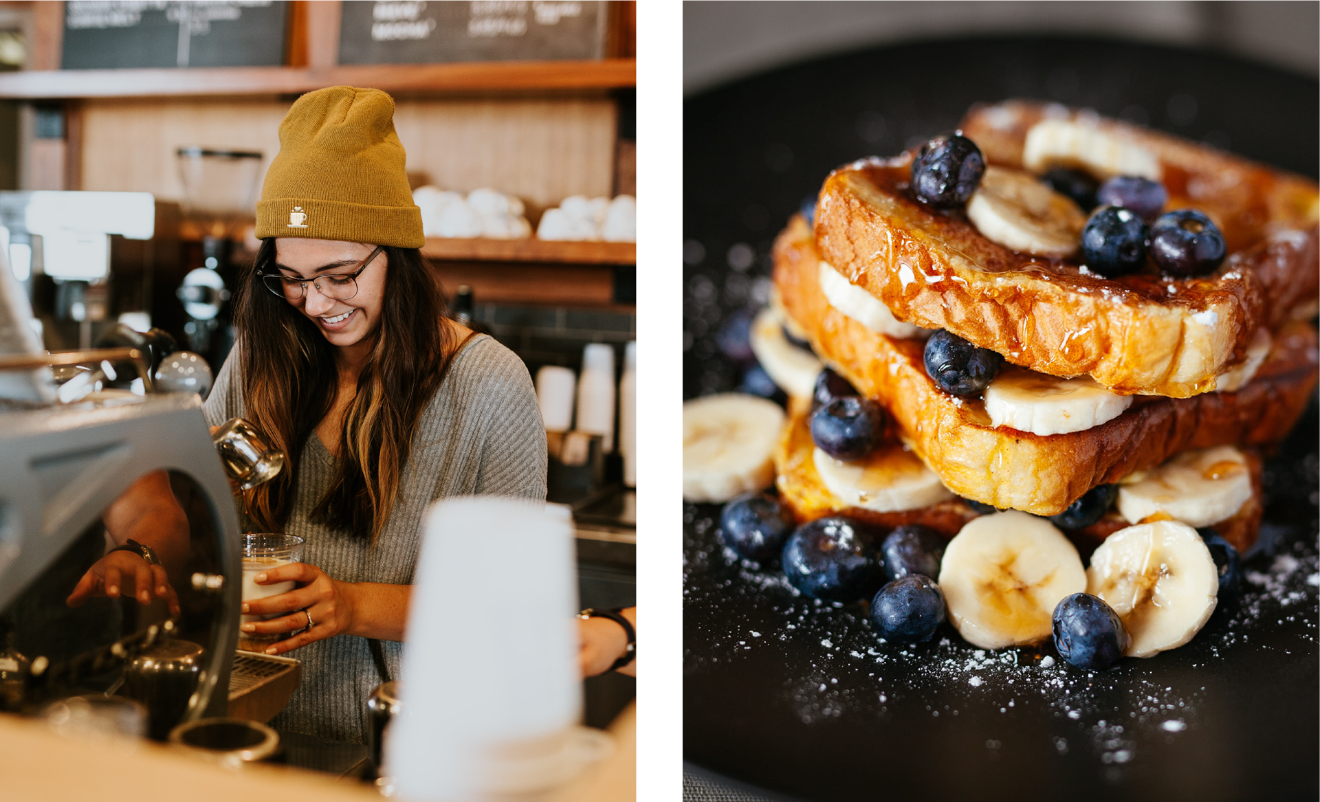
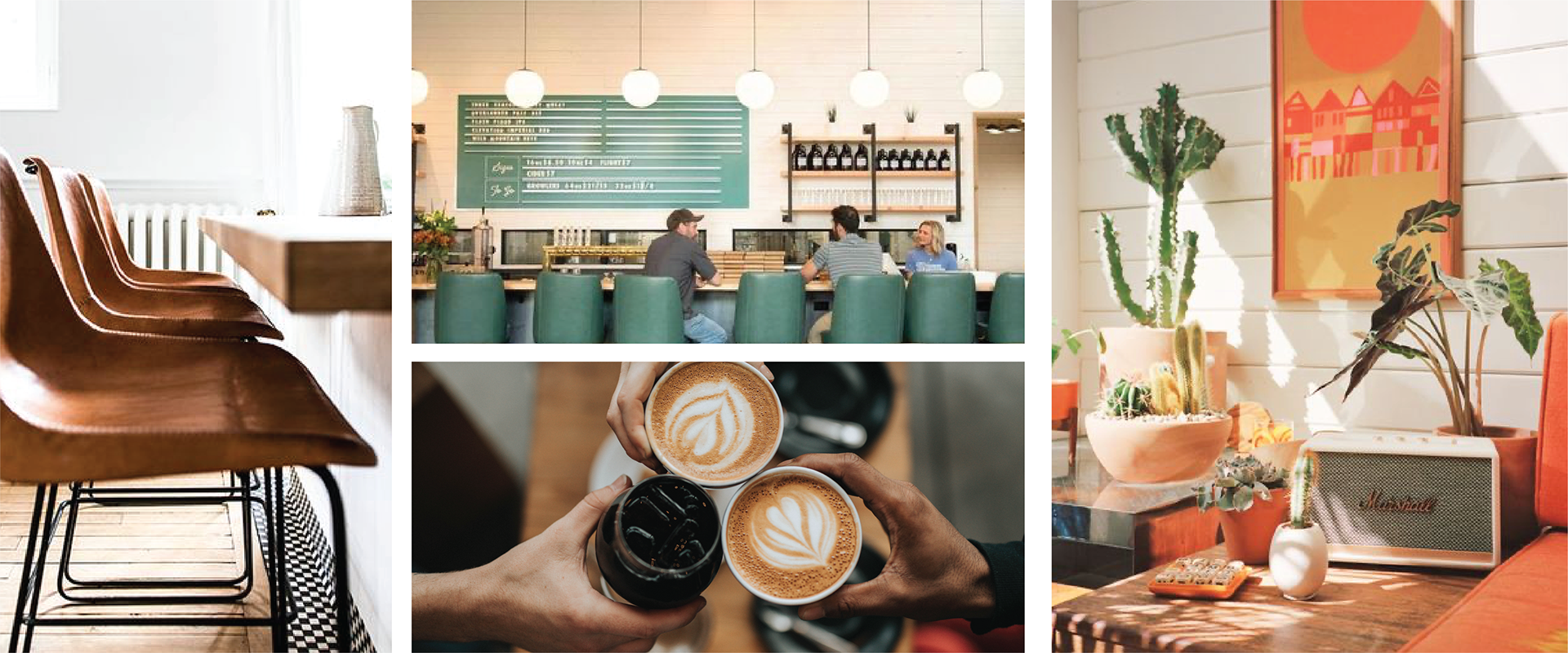
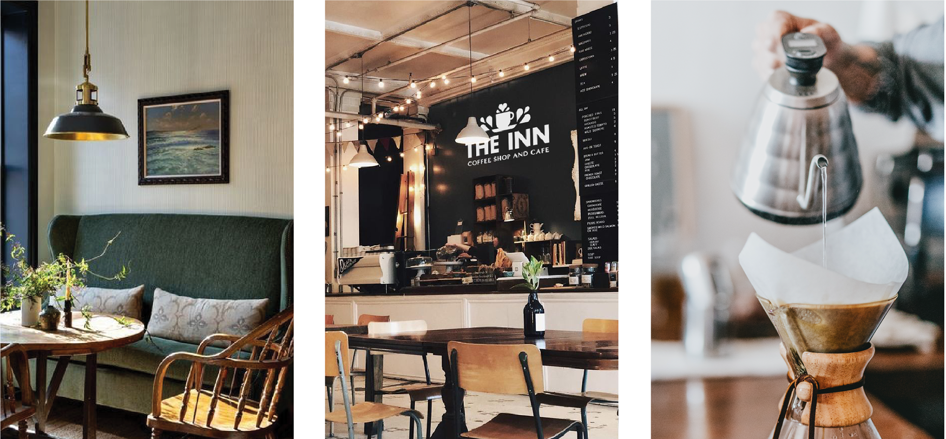
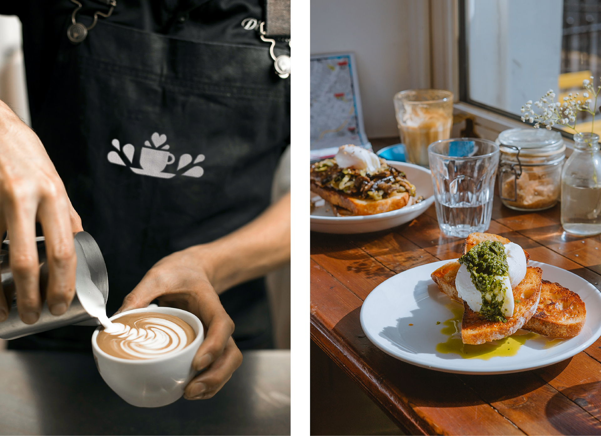
The design of the brick and mortar building was just as important to the brand of the inn as the mark itself. One of the brand words for the brand is "home," so The Inn couldn't feel like just another coffee shop. It needed to feel like a home with big dining room tables and different chairs and coffee tables as well as knick knacks and family pictures. The physical Inn needed to feel like you were being welcomed back home.